Berkson's Coming to Ruin Your Epidemiological Day
Try not to apply findings from studies on hospitalized people to the general population.
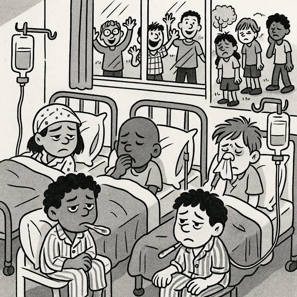
Suppose you’re trying to understand the risk of death after a three-dose vaccine series, but you’re doing it in a resource-limited country. You want solid, accurate data, so you go where the records are best: a hospital. There, you find 10 years’ worth of hospitalization data for children. Jackpot.
You comb through the records and find this:
Of 3,000 hospitalized children, 30% are girls, 70% are boys.
Among unvaccinated children, the in-hospital risk of death is 1%.
For those with one dose, it’s 5%.
Two doses? 8%.
Three doses? A grim 10%.
And among girls, the in-hospital death rate is 30%, compared to 10% in boys.
You sound the alarm. “The more vaccinated a child is, the more likely they are to die!” You call for a halt to the vaccine program. Someone starts whispering about Nobel Prize nominations.
Stop right there.
Because you’re wrong. You’ve just walked face-first into Berkson’s Paradox, a textbook example of collider stratification bias. Congratulations?
What Just Happened?
Berkson’s Paradox occurs when the relationship between an exposure (say, vaccination) and an outcome (say, death) looks different in your sample than it does in the full population. The culprit? Your sample isn’t representative. In this case, you only looked at hospitalized kids. That introduces a huge sampling bias.
Let’s break this down.
In the general population:
Vaccine coverage is about 80%. (Yes, even in a resource-limited country. Many do better than you think. The U.S., however, is trending downward thanks to misinformation, not poverty.)
The unvaccinated kids represent 20% of the population, but only the ones who lived long enough to potentially get the third dose. Those who died early? Not in your dataset at all.
Meanwhile, the population is roughly 50% female. However, in your hospitalized group, girls make up only 30%. Why? Let’s say, in this fictional country, boys are brought to hospitals more readily—even for mild illnesses—while girls are only taken in when seriously ill. That means hospitalized girls are, on average, sicker. And sicker patients die more often.
Now look at what this does:
Kids who aren’t vaccinated and get very sick might not even make it to the hospital.
Kids who are vaccinated are more likely to survive long enough to be hospitalized.
Girls who are hospitalized are more likely to be in worse condition, skewing the mortality data.
So, what looks like a terrifying pattern—more vaccine doses = higher death risk—is actually an artifact of your biased sample. What you’re really measuring is not the effect of the vaccine. You’re measuring who makes it to the hospital and when.
What This Means for Your Study (and for Public Health Messaging)
This kind of bias crops up a lot in studies that rely on hospital data. And it’s tempting to extrapolate those findings to the general population, especially if the results are dramatic. But don’t.
If you want to assess whether vaccination increases or decreases the risk of death, you need to analyze all deaths, not just the ones that occur in the hospital. Otherwise, your study is only telling you what happens to a narrow, highly selected group—and that’s not the same as telling you the truth.
Unless, of course, you’re an anti-vaccine influencer. In that case, you’ll run with this flawed conclusion, slap it onto a colorful infographic, and maybe even insert it into a government hearing.
But if you’re a public health professional—or just someone who respects data—understanding Berkson’s Paradox might save you from getting things dangerously wrong.


Very good!